Crescent Creative| Behind the Brand
Premium Social Influencer Experience
Crescent Creative Group
Brand Overview and Styling Inspiration
About Crescent Creative
Crescent Creative constructs creative brands and website designs for bold entrepreneurs in Houston, Texas. Kate Davis is the mastermind behind these fresh and striking designs.
Kate’s Goal
- She wanted to create imagery that created a strong and authentic representation of who she is and allow people going to her business page to build that trust with her quickly
- She was re-branding her business and wanted to wow her future clients with professional photographs.
Working with Kate
Working with Kate has been an amazing experience. She is so real and down to earth. I really enjoyed able to help brainstorm and bring her creative visions to life. I have been able to not only been able to work with her with our Branding Experience, but also with our Social Influencer Society. I love working with creative and vibrant people just like Kate with Crescent Creative!
Inspiration/Aesthetic

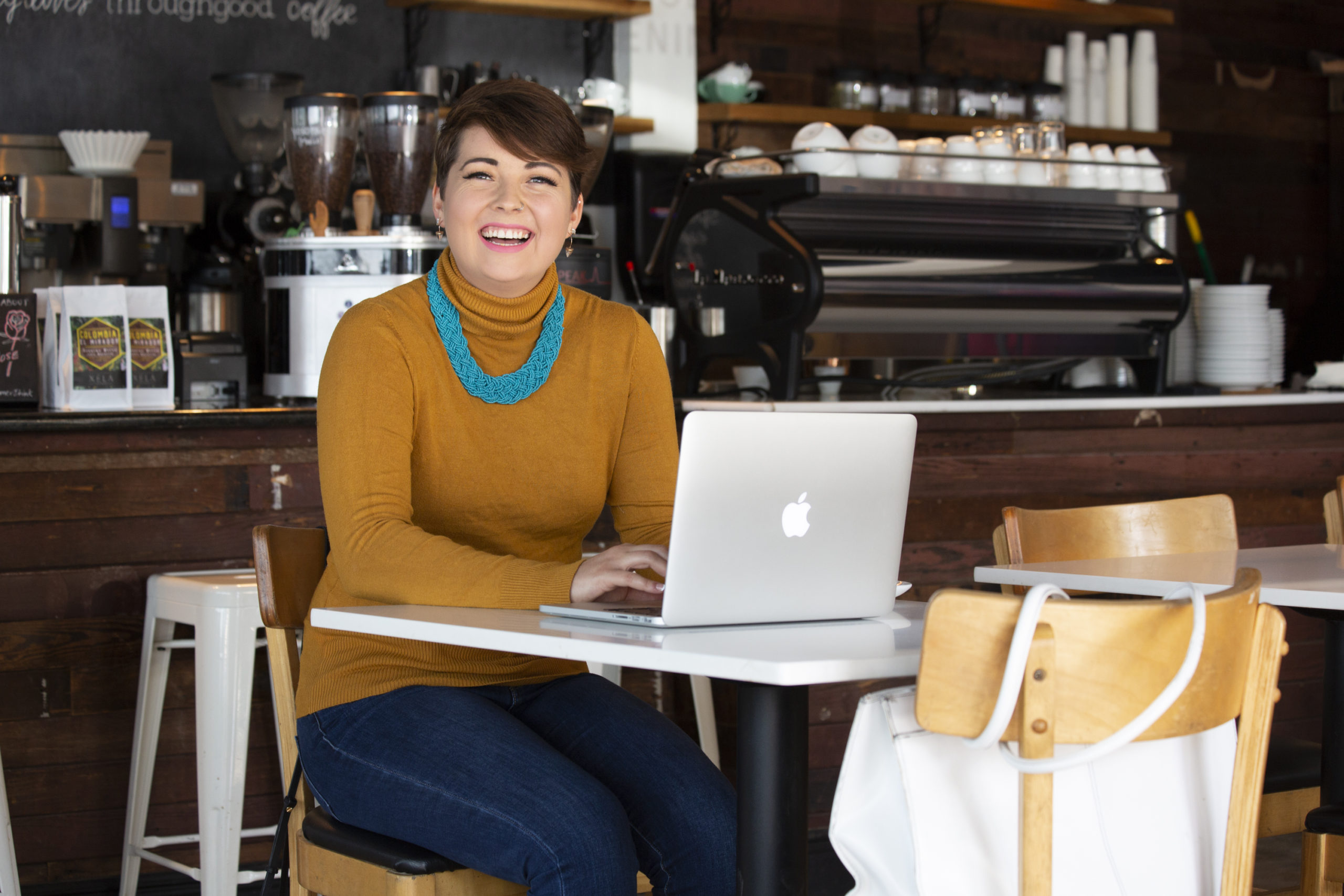
The inspiration behind this branding session started with the idea of a rustic coffee shop. Kate desired images that looked rich and comfortable for her clients. She wanted to use this to have a welcoming and approachable feel to her images. We feel in love with these inspiration images on Pinterest. They had a very soft feeling to them, which helped with the openness Kate requested.
Our Location

We tried finding a space and location that filled that aesthetic we wanted. We ended up finding an amazing space called Throughgood Coffee. It is found in the northern greater heights area in Houston. Just west of Highway 45 and south of highway 610.
Go checkout Throughgood Coffee Here!
Color Palette

With this photoshoot, we wanted to stay with rich warm tones. Something that would not only complement Kate’s skin tone but also colors that would draw the views eye and keep their attention for long periods of time. Nothing is better than a mustard yellow and cherry red with a blue accenting. These three colors are actually used in a lot of other popular brands out there. I could not be more happy with how these colors translated in each of her photographs.
Makeup

When it comes to the make up inspiration for this look we wanted to go with something classic. We had two looks to unfold here. The yellow look we wanted a very matte and neutral feel to her skin. Nothing too flashy. Something very clean and professional. As we moved into the second look with the red, we wanted to intensify and add a dramatic red look. This brought a very 50s/90s feel, which Kate absolutely loved!
Wardrobe

To tell you the truth ladies, this is one of the most fun parts of the construction of the branding session for me outside the photographing part. Being able to create and design outfit pairings can make or break how you truly feel about yourself.
With Kate’s look wanted to follow the same rustic/retro theme that we had with the inspiration and location. This keeps the messaging clear and helps lower confusion. We found this yummy yellow sweater and paired it with a chunky statement necklace to help pull Kate to the forefront of the photo. The Red look is our classy/cool look. We wanted to incorporate the relaxed feeling of the jeans with the bright feminine details of the red top with the cool retro feelings of the sunglasses and detailed flats. Overall, So pleased with how each outfit came out and most important Kate loved them!
Info/Contact
Crescentcreativegroup@gmail.com
Kate Davis
Houston, Texas
Crescent Creative Session Highlights


Join the community!
Share your email to receive news, updates and seasonal discounts.
Subscribe to our newsletter!
We promise to always respect your privacy and your inbox.
Follow us!
@SheAuthenticPhoto
Copyright 2020 | She Authentic


